19 May 2021
Colour In Design
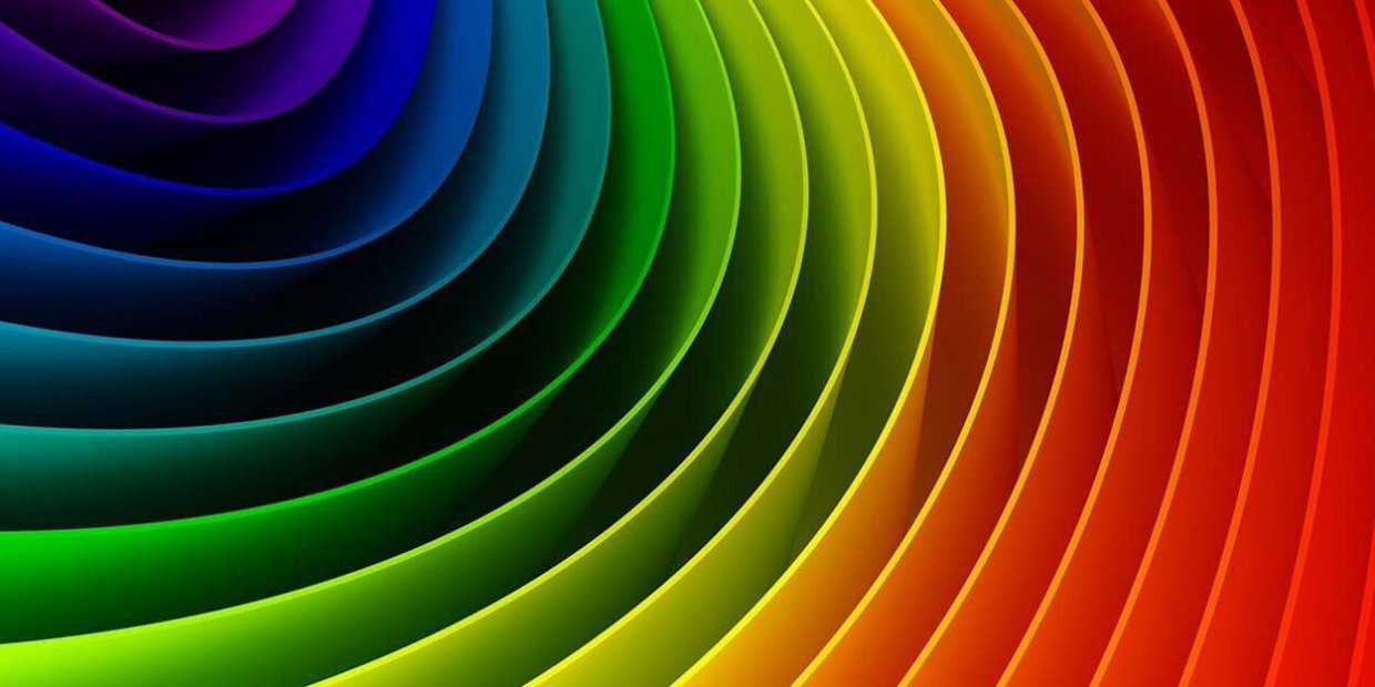
Colour is undoubtedly one of the biggest elements in interior design and is a powerful design tool that arguably has more influence on a room than any other factor. 2021 has seen a huge resurgence in colour, not only in design but in fashion too. This is perhaps in a bid to erase the woes of the last twelve months and move forward with a focus on positivity and anticipation for change and a brighter future.
Pantone echoed this sentiment at the start of 2021 when it announced it’s colours of the year, it was only the second time in history that two colours had been announced simultaneously, a fitting tribute to such unprecedented times.
Pantone’s Colours of the Year are:
Ultimate Grey 17-5104 – a solid and dependable shade, based on natural elements.
Illuminating 13-0647 – A warming and optimistic shade bringing energy and hope.
They are two supporting colours, fortitude but with a sense of joy. Poised and composed but with energy and vivacity. A firm resilience but with hope for the future.
It isn’t just in recent times that colour has been important, colour has an enduring connection to psychology that dates all the way back to the Ancient Egyptians who studied the effect of colour on mood and used it to to accomplish holistic benefits. For example, yellow was thought to inspire feelings of joy, orange to increase energy and blue to comfort and soothe pain.
More recently the development and study of psychology has expanded to include colour and some of these findings are now being used in key tools for marketing, design, and architecture.
Of course these matters are subjective but it is widely agreed that certain colours evoke specific moods and feelings. Here is what some of the main colours are thought to represent.
Red
Not one for the faint of heart, red evokes feelings of love, passion and desire but also determination and strength. Very powerful in it’s most basic form, it can be a bit of an overwhelming force to be reckoned with when it comes to interiors. Perhaps choose one if it’s many beautiful sister shades including, burgundy, crimson or tomato red.
Yellow
Synonymous with optimism, joy and energy linked to the sun’s power and all it brings, yellow is also associated with freshness and intelligence.
Orange
Orange symbolises enthusiasm, happiness and creativity. Although too much can induce feelings of anxiety. Burnt oranges and terracottas are great for bringing a rich, warm and tactile feel to the home or workspace.
Green
Summoning a sense of nature, and a key colour in bilophilic design, green is said to elicit tranquility, stillness and calm. It is also thought to have restorative qualities. Green is a wonderful colour to use in your interior and comes in an abundance of attractive shades, such as forest, olive, and emerald making it an incredibly versatile colour. Green is also this years key colour style for kitchens.
Blue
A powerhouse on the colour psychology spectrum. Deep blues are associated with feelings of loyalty, trust, peace and stability and are great for classic living room design. (Need we mention the world’s obsession with Farrow and Ball’s Stiffkey and Hague blues over the past couple of years?)
Lighter blues are more calming and give reference to nature, reflective of the colour of the sky and sea. A cool, calm choice for bathroom or bedroom design.
Pink
Symbolising love and compassion, pink brings a nurturing energy when brought into the home.
Black
Black promotes qualities of sleekness and sophistication and is guaranteed to add drama to any living area. No longer banished for use solely as an accent colour, black is more and more often being used as the main colour scheme in all aspects of interior design
Grey
As mentioned with Pantone’s Colour of the year choices, grey is a versatile colour that promotes a sense of solidity, security and composure.
It may feel challenging experimenting with colour but it really doesn’t have to be. There are clever, subtle ways of incorporating colour into your home for a more nuanced effect.
Choose more muted tones, you’re likely to get on better if you take a more gentle approach.
Start by just painting one wall, or invest in a few accessories in your chosen colour such as cushions, bedding, lamps or artwork.
Colourful pieces of furniture will elevate a room. You could start by adding smaller pieces of furniture and size up as your confidence grows. A more economical and sustainable way to play with colour in furniture would be to have pieces you already own re-upholstered.
Choose to add lots of plants to enjoy the calming benefits of green and to add a biophilic element to your space.
Brightly coloured appliances and cabinetry can go a long way to refreshing a kitchen’s appearance.
We hope you choose to experiment with colour and that we have made the process feel much less daunting. What are the colours that bring you joy and lift your mood? Will you be bringing them into your home this year?